Jupiter Java
Personal Project / Brand Identity / Packaging / Adobe Illustrator & Photoshop
For my personal project, I opted to rebrand one of my favorite coffee shops, a small mountainside cafe called “Jupiter Java.” This coffee shop is located in the Legacy Lodge in Park City Mountain Resort located in Park City, Utah. I wanted to create a color scheme that brought together the cozy feel of a coffee shop, but maintained the sophistication of the ski resort.
Sophisticated, Clean, Inviting, Friendly.
Instagram Curation
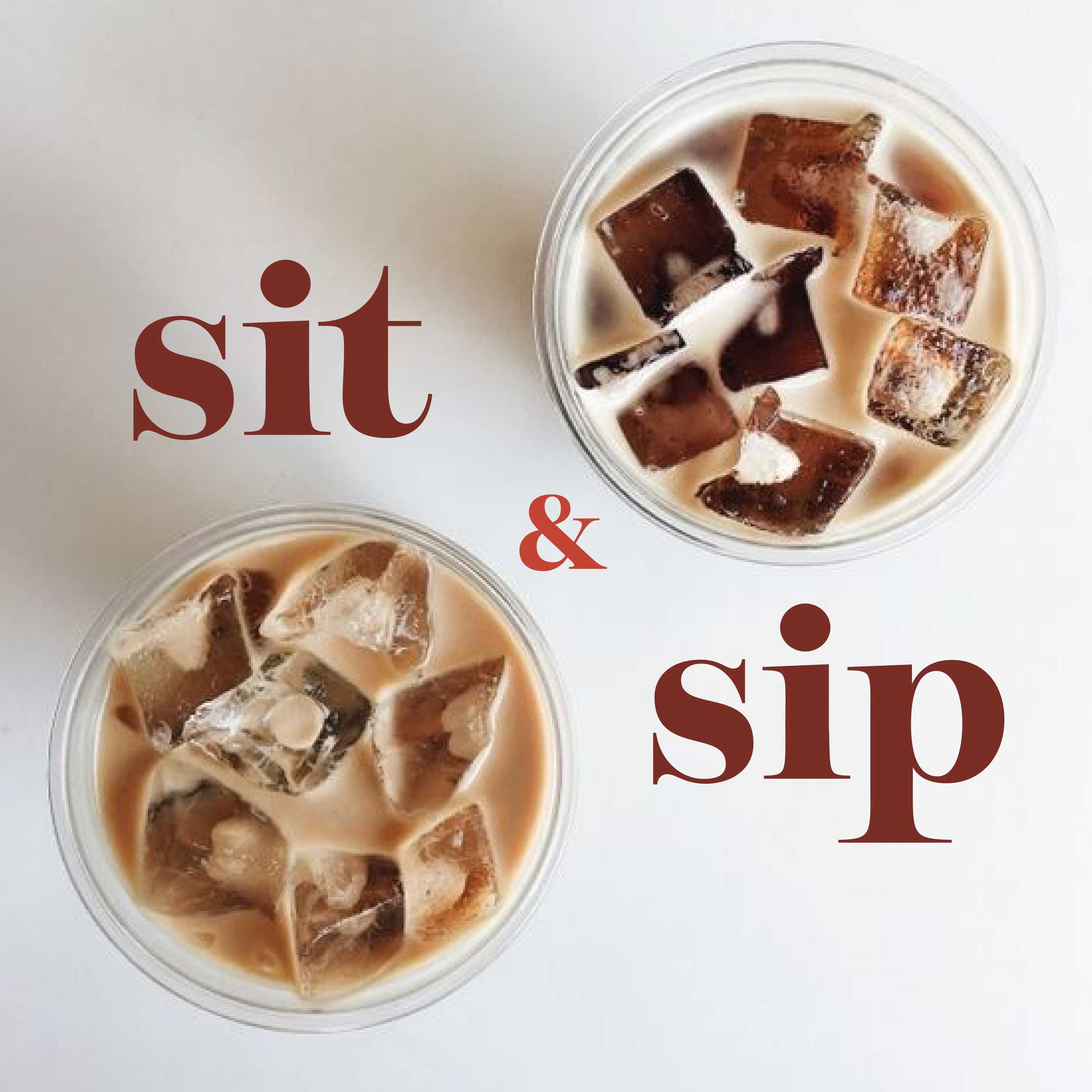
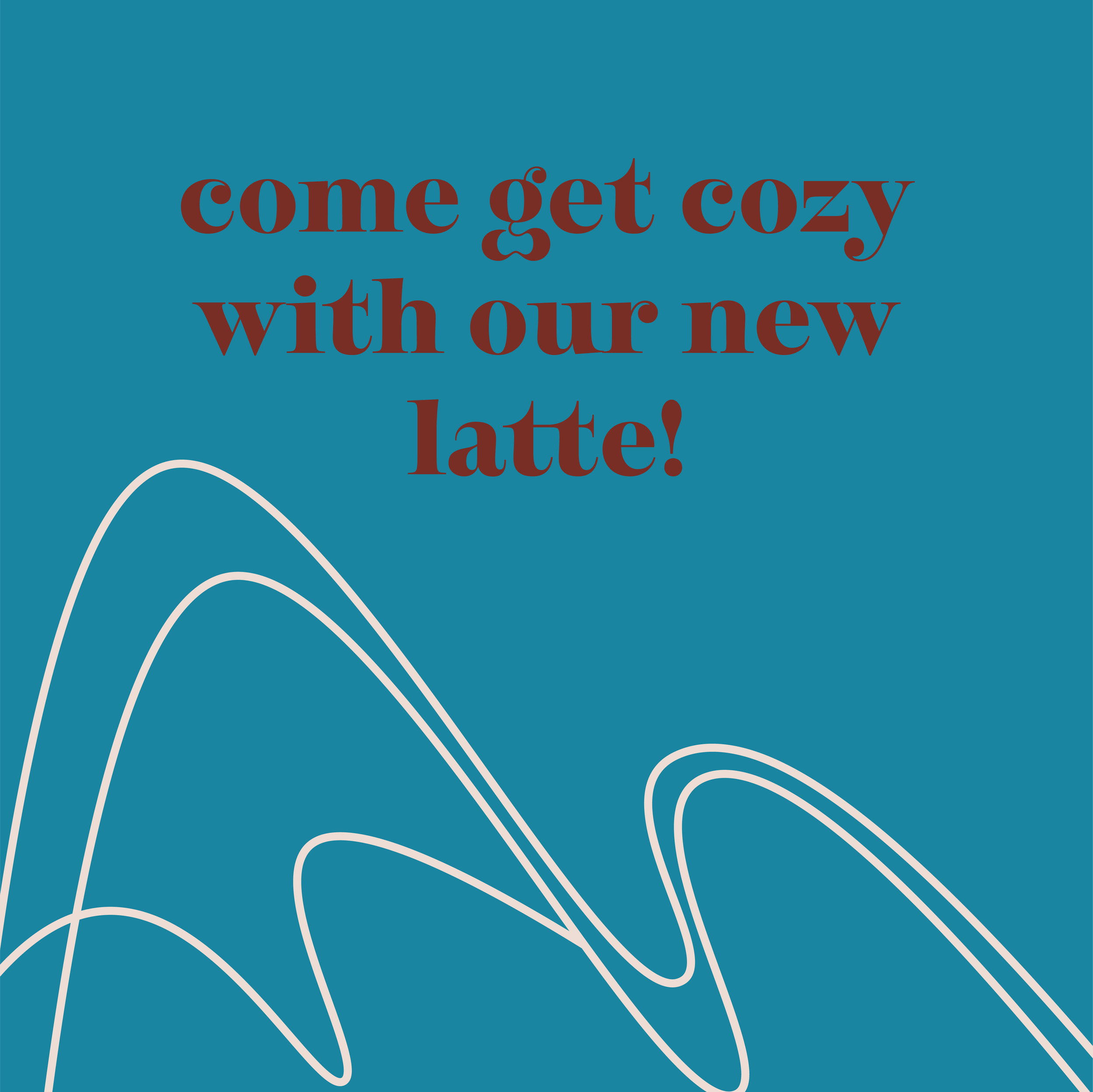
Curated an instagram that shows potential for employee shoutouts, daily motivation, images of products to be sold, and advertisements for specials going on that day at the store.




Sketching
Initial sketches, random ideas jotted down on paper. Some ideas were bad, some were good, but this was just an exercise to put my ideas on paper and to eliminate concepts that wouldn’t help my design process.
Type Study
Playing with different fonts. Tried serif compared to sans serif, tried all caps and lowercase. Fonts and studies are included. The words I used to drive my inspiration and process were:
Sophisticated. Clean. Inviting. Friendly.
Word Mark Explore
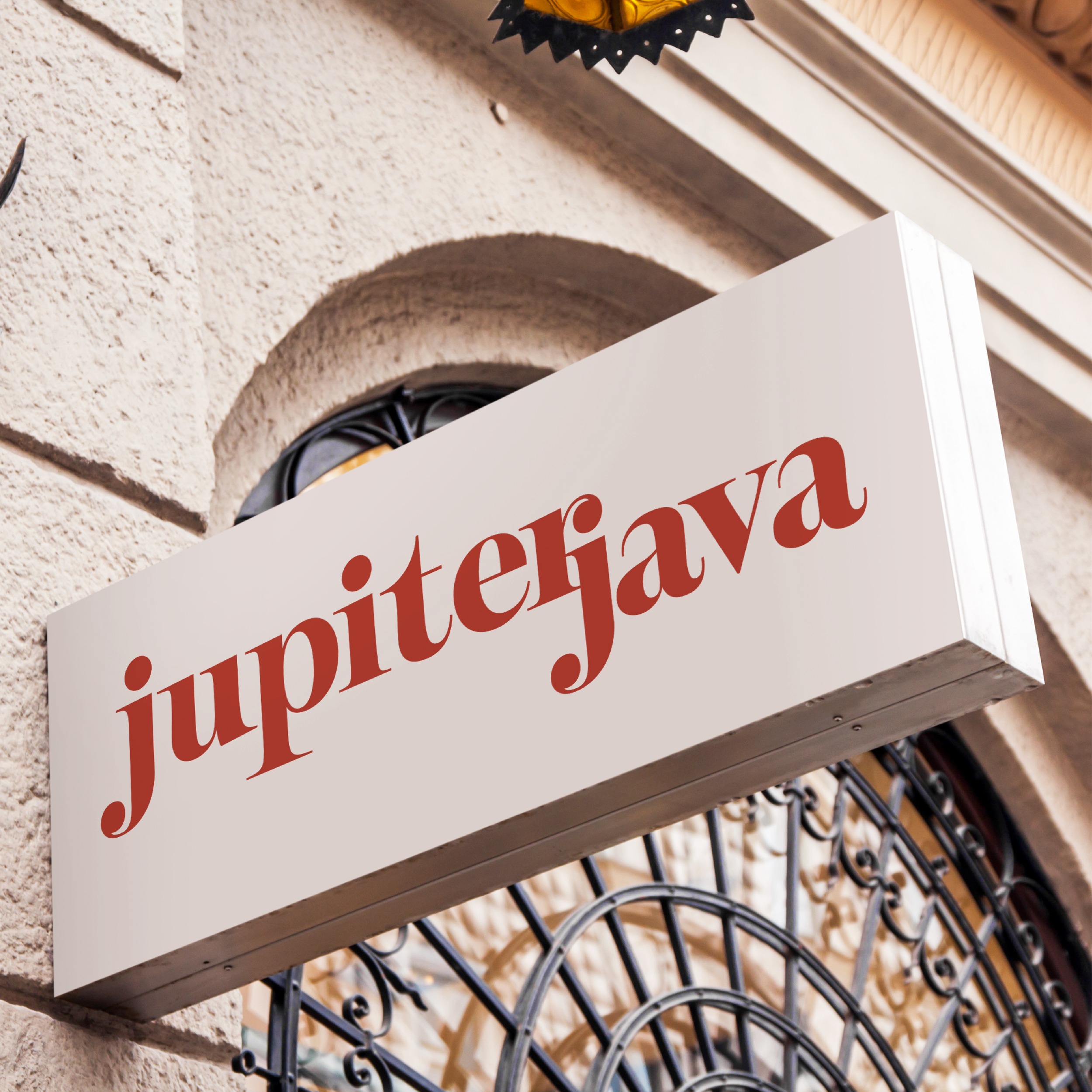
Used font from type study that fit concept, explored how to make it a word mark to be used for marketing purposes. Created a long word mark that includes the entire name, as well as another “abbreviated” version of the name.
Color Study
Final Branding
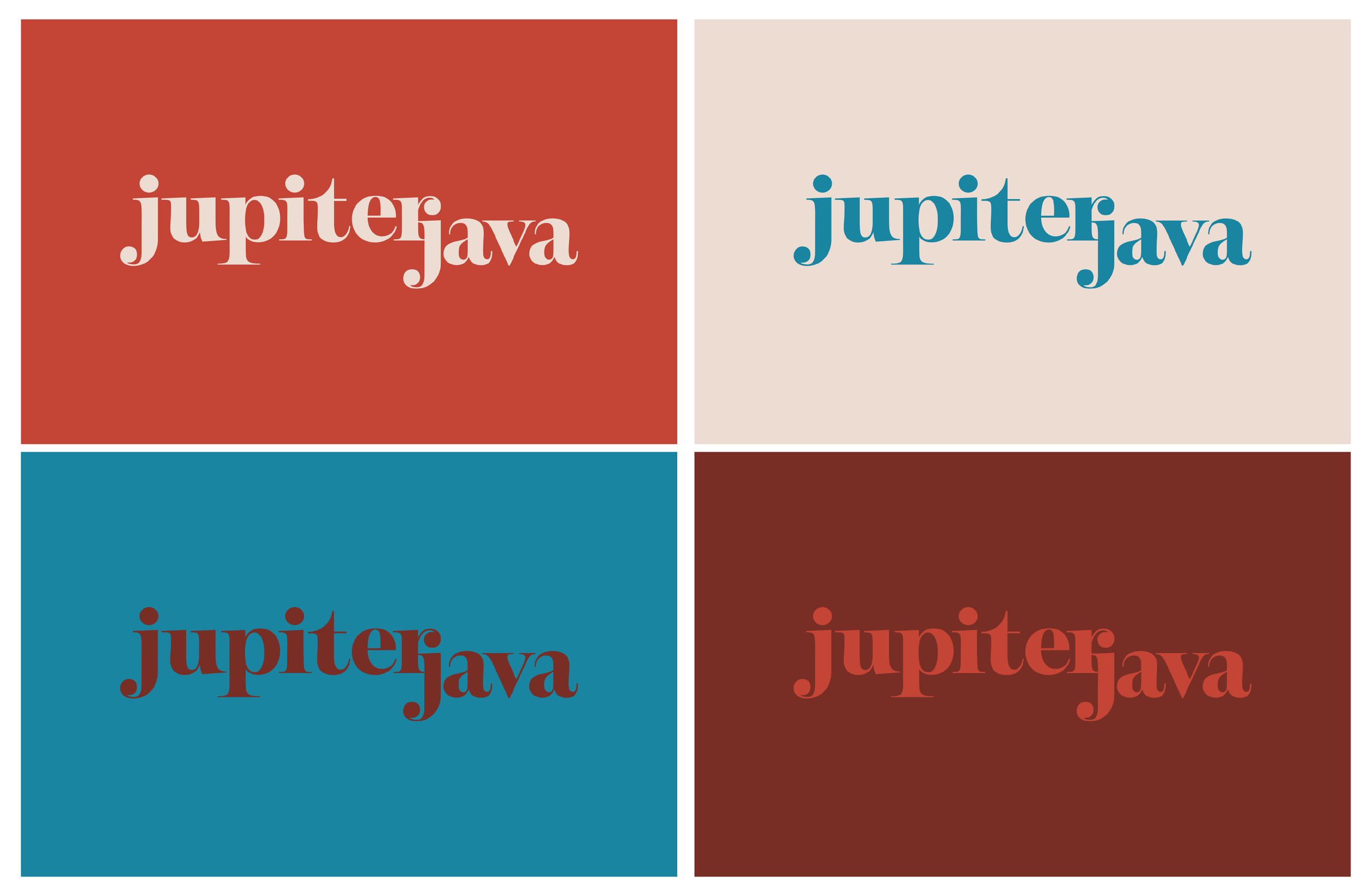
Colors represent the sophistication and location of Jupiter Java. Located in the mountains, the dark brown and orange colors pull the “earth” into the concept, while the blue creates sophistication and contrast against the orange.
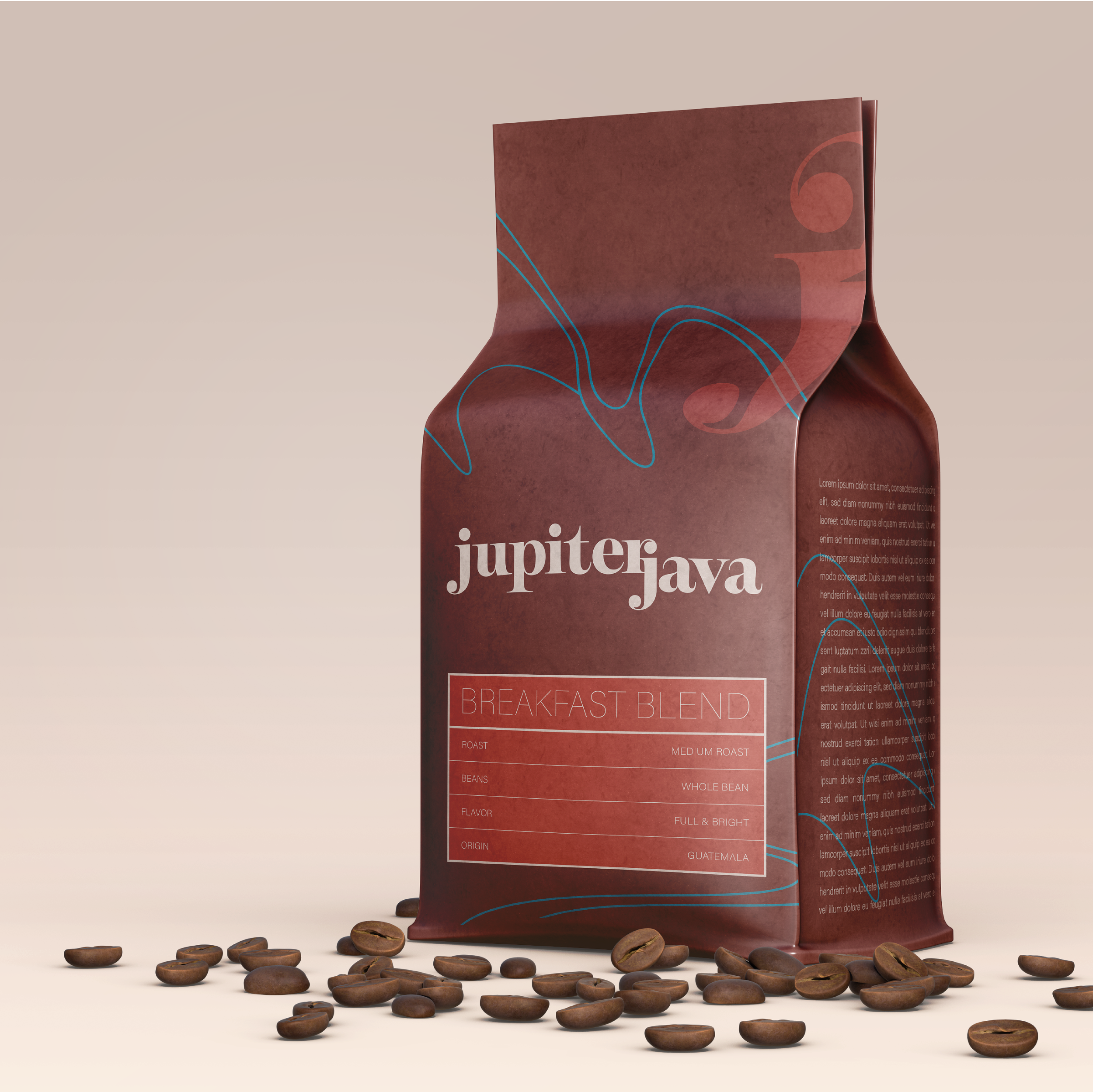
Coffee Packaging
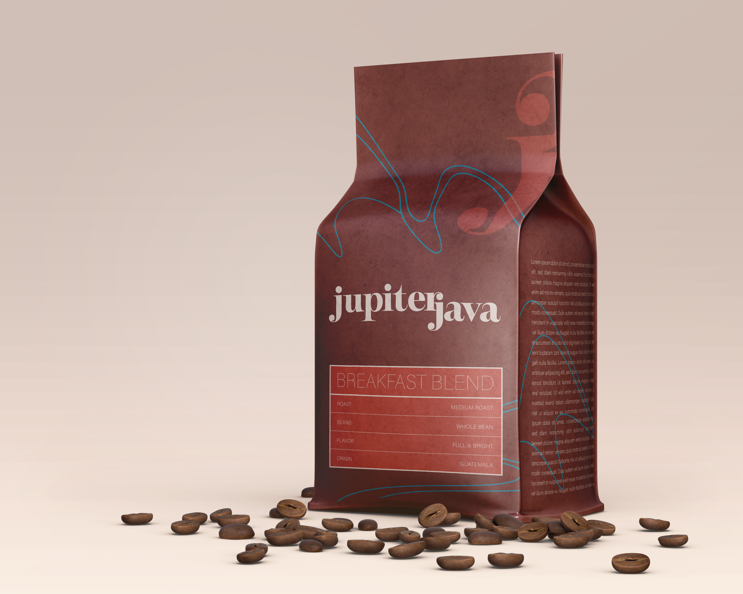
Maintains the sophistication and branding with text and color. Blue lines show outline of a snow capped mountain and flow throughout the packaging.
Branded Java Jacket
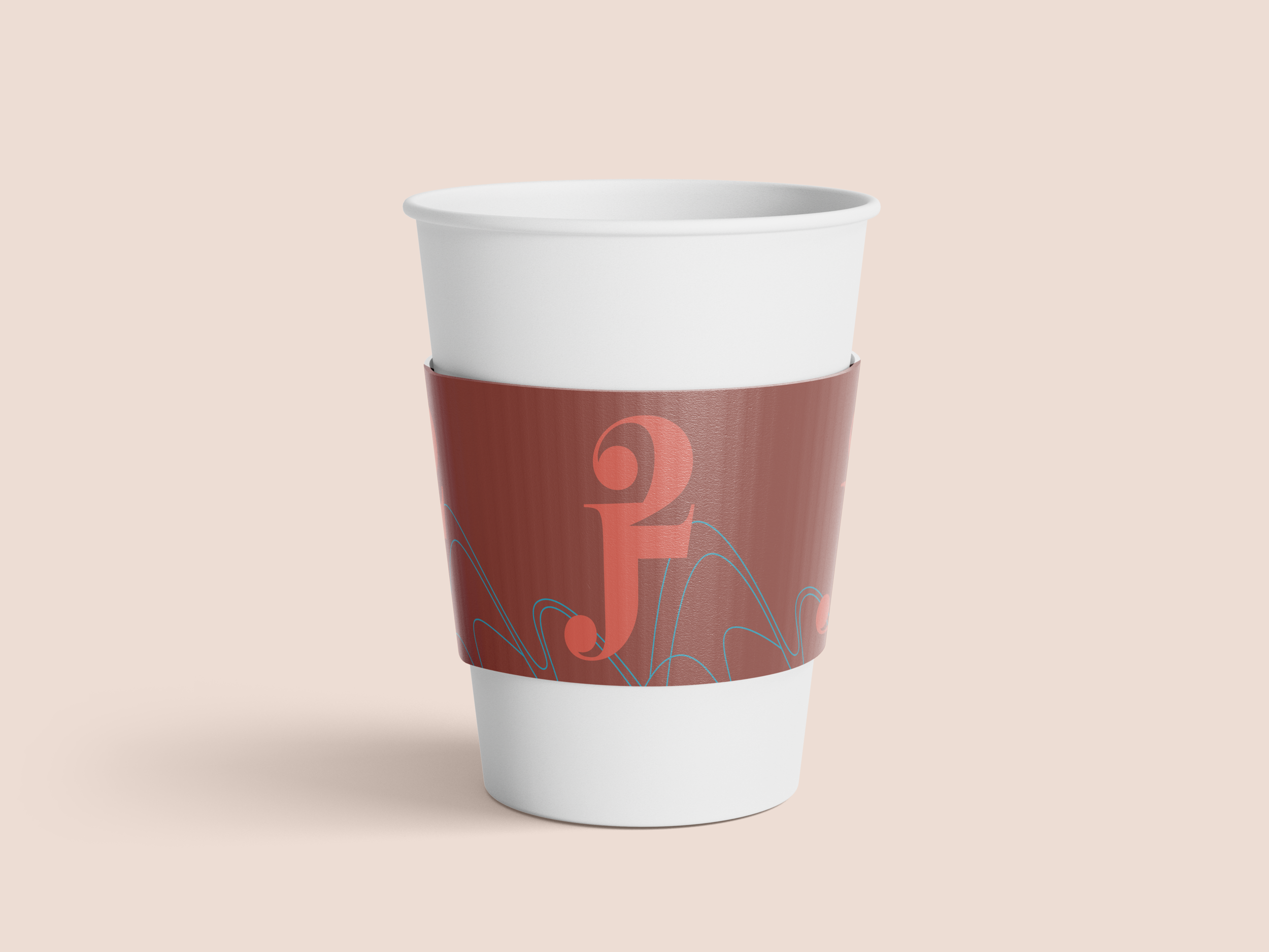
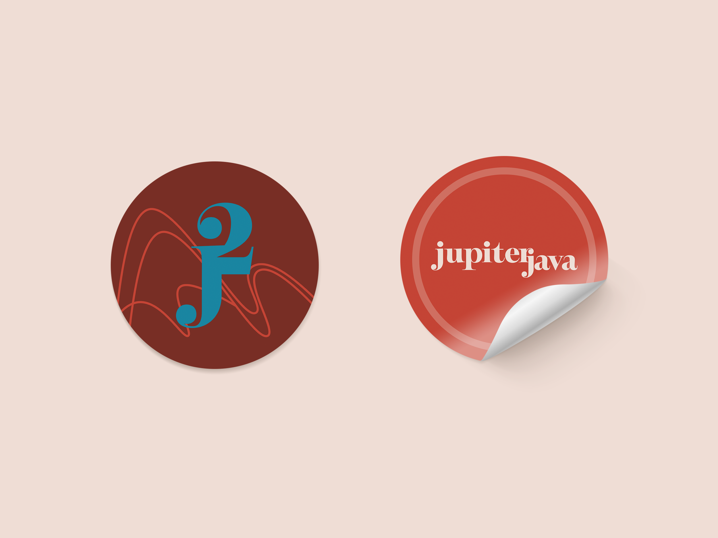
To shorten the name, J^2 takes its place.
Branded Stickers
Incorporation of both forms of name, mountains outlined in back.


