PUBLICATION DESIGN.
Typography / Adobe Illustrator, Photoshop, & Indesign
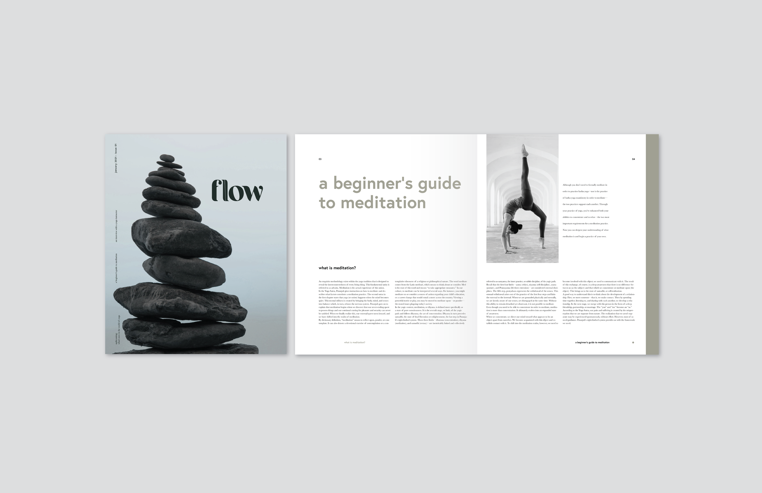
To apply typographic theories & principles to create a magazine design system and explore typography through identity development. Considering form, structure, & style, creating a wordmark for a magazine that communicates meaning & begins to build a visual language. The goal of this process was to create a concept statement for the publication, then to create a word mark to represent that concept. The concept statement for flow is: A meditative guide grounded in the traditional, yet free spirited practice of yoga.
Dynamic Stillness, Asymmetrical Balance, Sophisticated, Grounded, Approachable.
STEP 01. CREATING A TYPOGRAPHIC WORDMARK.
-

SKETCHING
Initial sketches on tracing paper. Explored ways to incorporate movement while maintaining the feeling of being grounded.
-

DIGITAL TYPE STUDY
Explored serif, sans serif, and script fonts to portray concept.
-

FINALIZED TYPE FACE
Fragille Reguler. Strong serif terminals, contrast from thick to thin of letters, stress of “o,” & rounded curves consistent throughout letterforms.
WORD MARK PROCESS
The process of altering the original typeface, Fragille Reguler, to fit the message of this publication.
FINAL WORDMARK ITERATION
Thickening the lines in “w” & bringing the rounded terminal from the “f” into the end of the “w.” Helps to optically close the word and create balance between the letterforms.
COLOR ITERATION
Muted, grounded, breath, clean.
STEP 02. DEVELOPING A COMPOSITION.
TYPE COMBINATION STUDY
After collecting articles & doing research, studying how typefaces interact with each other to further communicate the message of the article.
COMPOSITION ITERATIONS
Generated over 40 different layouts, spread sizes, & grids testing readability & portrayal of message.
FINAL COMPOSITION & LAYOUT
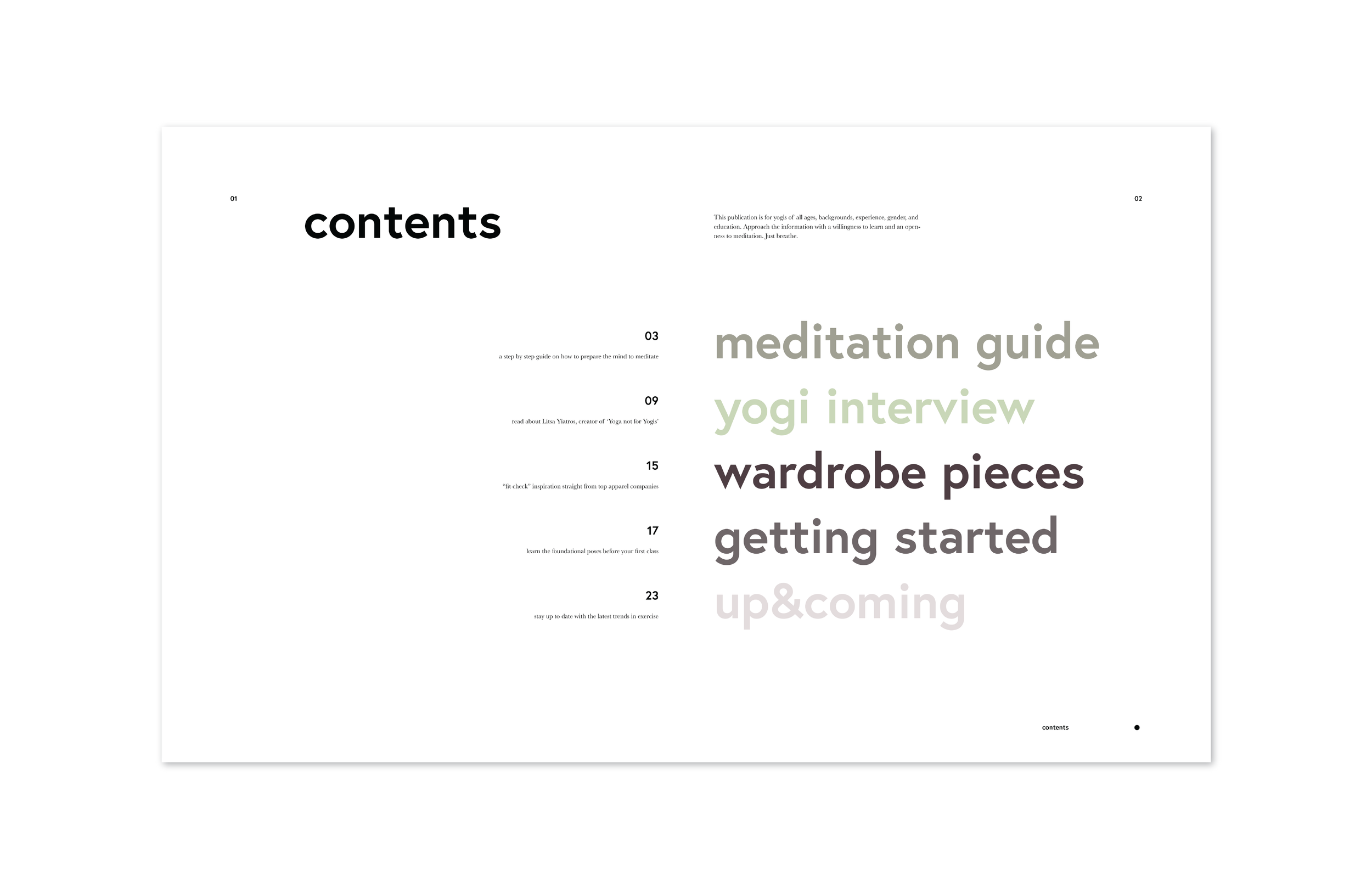
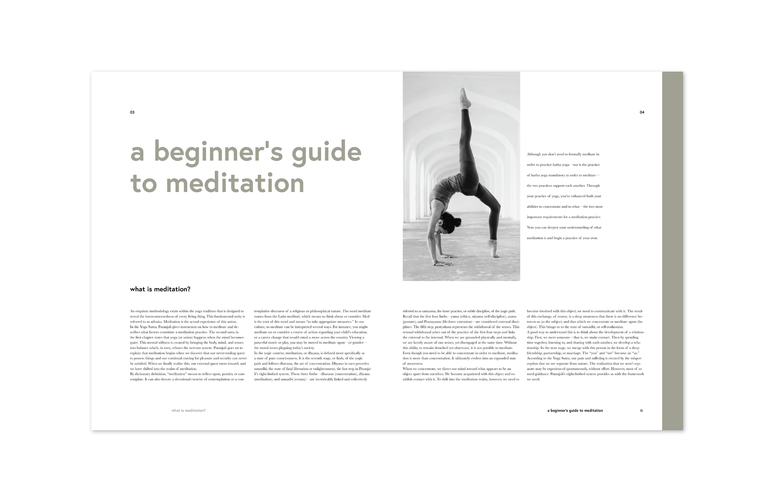
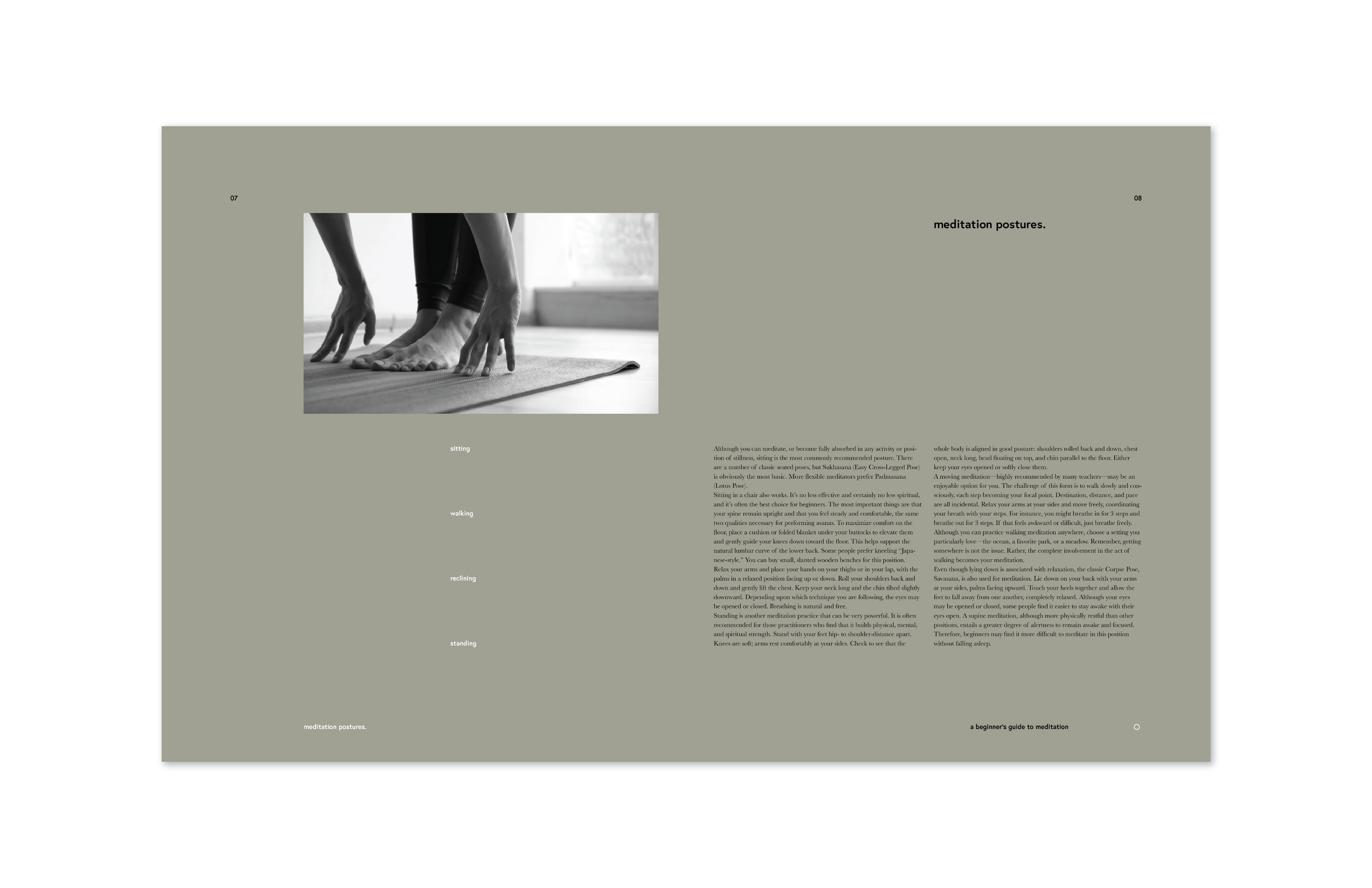
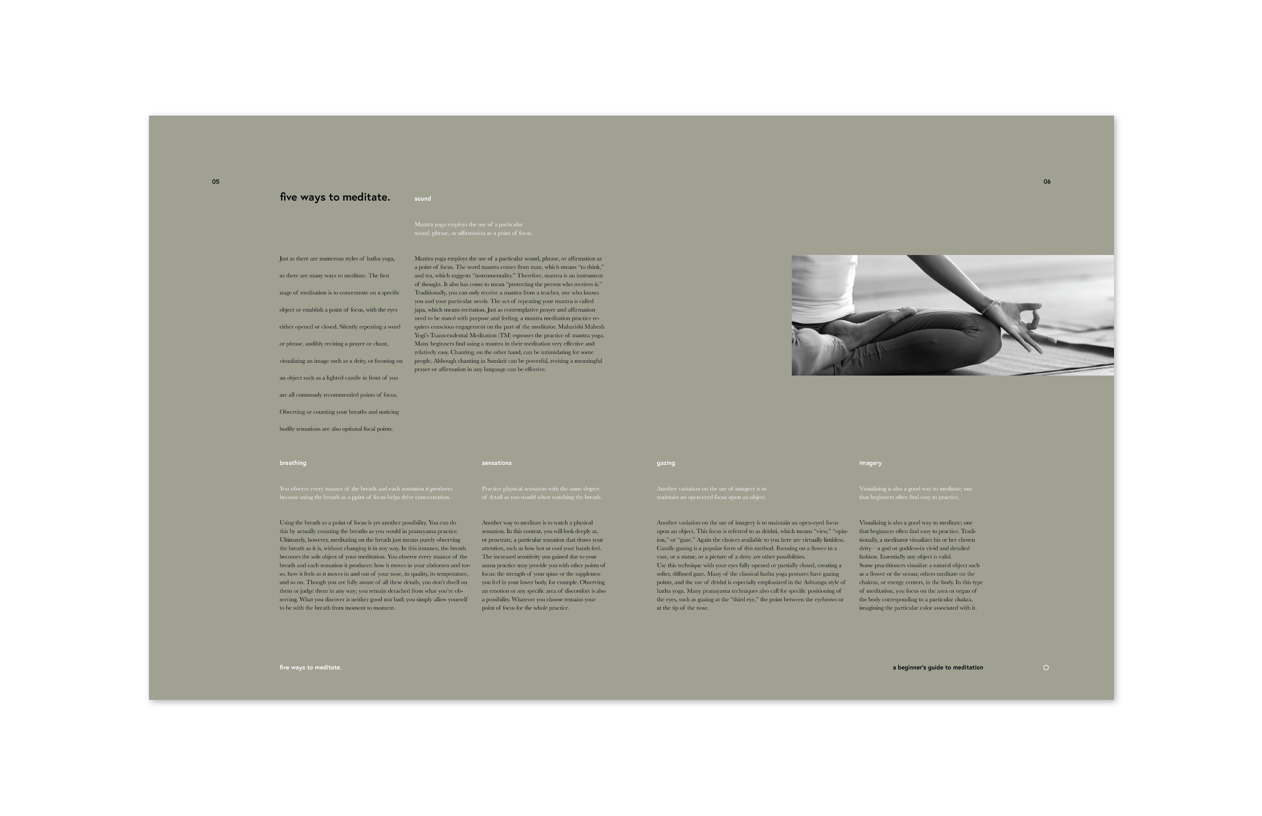
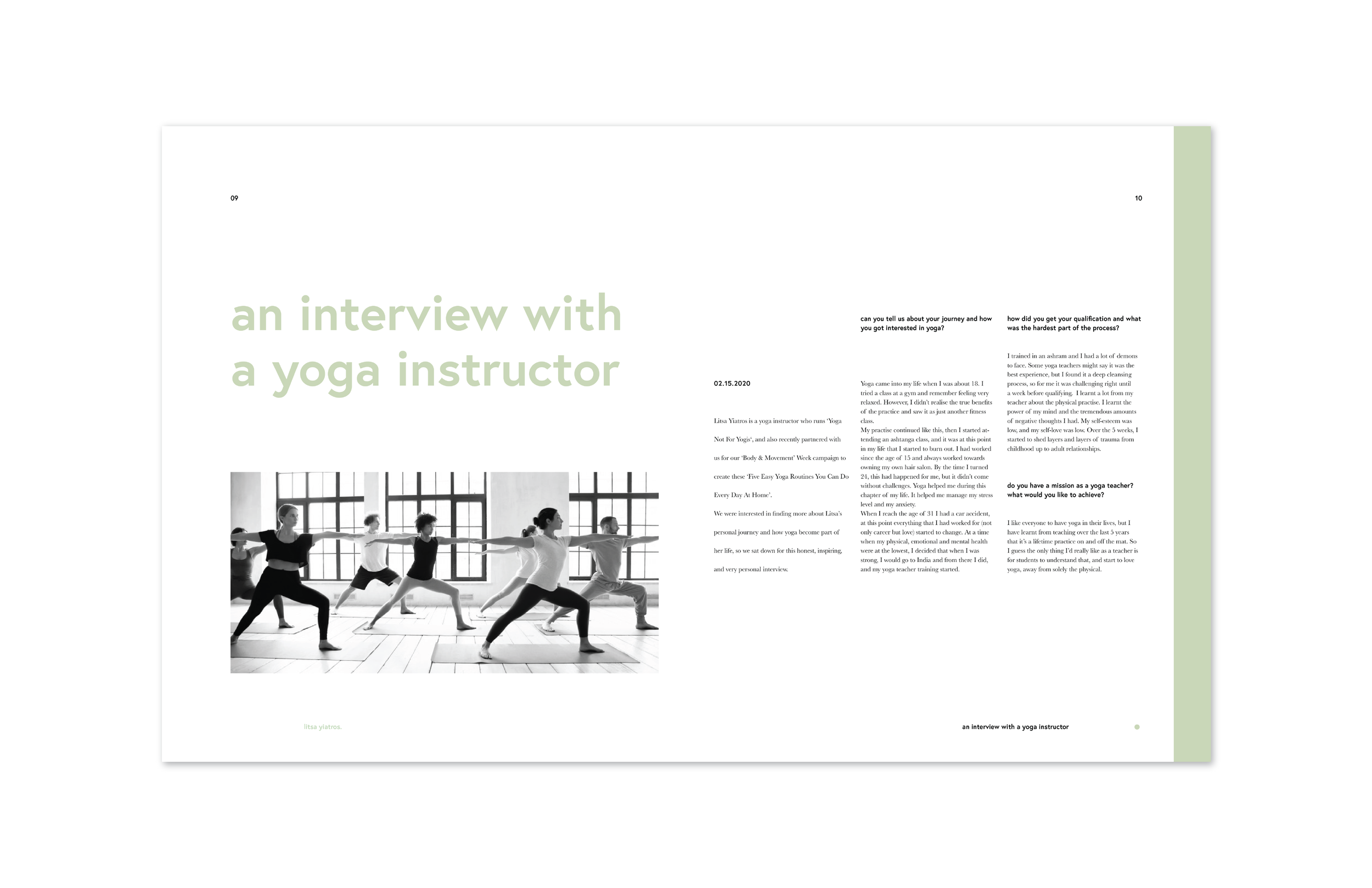
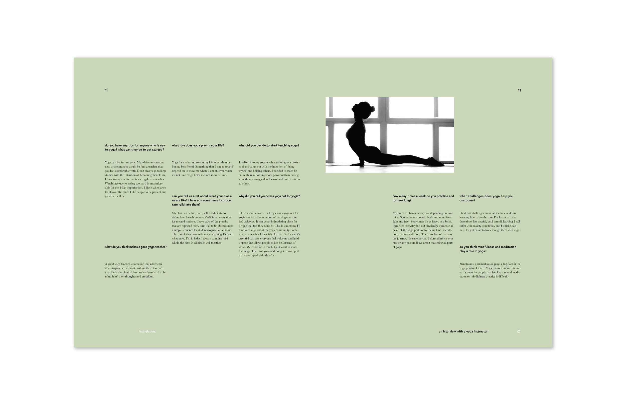
This book is meant to sit on a coffee table & be picked up for leisure reading. The larger pages allow for the reader to slow down & absorb the information as they read it. The topics in this publication address meditation & the rhythm of life, so the page reflects space, breathability, and creates a sense of calm for the reader.
Sophisticated, clean, breathable.
CREATING A VISUAL LANGUAGE
Creating guides to follow when constructing the final publication spreads.
STEP 03. PUBLICATION CONTENT & SPREADS.
